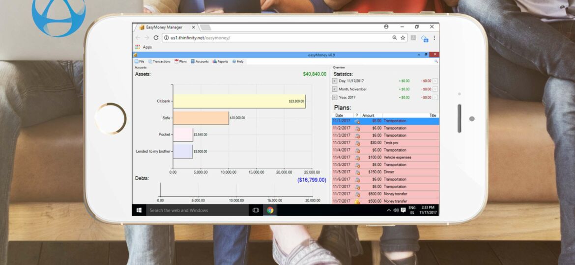
 With more than half of the total internet traffic being accounted for by smartphones and other portable devices, considering taking your desktop applications to mobile environments is a must.
Unlike native web applications, which can adapt their layout to the viewing environment by using responsive web design, each Thinfinity VirtualUI application runs as an instance in the server and its screens are displayed in a canvas element in the browser. In order to adapt the application for mobile access, different matters have to be taken into account. In this article, we will go through some essential tips that will help you re-think your application interface in order to attain a seamless experience for your users in both desktop and mobile worlds.
Desktop application design differs from mobile’s. Besides the obvious size difference, each device type has different capabilities. Thinfinity VirtualUI allows you to modernize and adapt your desktop applications to mobile devices. The VirtualUI class has a property called BrowserInfo, which helps you detect by code the device, browser, and many more details regarding the environment of the end user’s device. This information will assist you in delivering the best possible user experience.
This item list is intended to help you think about how to adapt your desktop application so that its use from a mobile device can feel comfortable and natural.
Let’s get to work:
1 – Take maximum advantage of the mobile screen’s space.
Screen space limitations are felt more in mobile environments than in desktops.
One way you can ensure that the application uses all the available space is by removing the “minimize”, “restore system” and related buttons from the caption bar. Don’t forget to run the application maximized!
In this way, not only the application will always use all the available space, but you will also prevent its execution in an undesirable size.
2 – Take maximum advantage of your application’s space.
Think about what will be seen on each portion of the screen. You want your application’s elements to be prioritized while not wasting precious space with excessive embellishment. A lean and clean design focused on the content is always a good idea for mobile applications. It’s all about the balance. This brings us to our next tip.
3 – Check clickable element’s disposition.
The accuracy of a finger’s touch differs a lot from that of the mouse. When using a relative mouse, this might not be an issue. But when using absolute mouse mode, clickable elements need to be separated enough so that users will not click one when trying to click another.
4 – Pay special attention to toolbar buttons
Toolbars are really nice and useful in desktop applications. But the same toolbar seen in a mobile device might not be adequate.
Take the buttons’ size into account and respect the space between them. Also, whenever possible, choose a toolbar that allows you to show only the most used buttons by default, so as to occupy the minimum indispensable space.
5 – Use self-adjusting UI components
Select and configure UI components that have the capability of self-adjusting their own width, height, and font size. Let them auto-adjust relatively to their container’s size. Whenever possible, don’t use fixed-size panels. Also, consider whether panels should have scrolling.
6 – Define form elements disposition based on relative anchors
Likewise, try not to position elements in fixed coordinated relative to their container. Remember that this is not responsive design or liquid design. Elements will not automatically flow depending on the size of the form, but they can be aligned or centered against the margins.
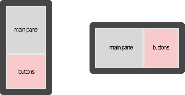
7 – Take device rotation into account
Should you take device rotation into account or can i “force” the application to work only in portrait or landscape mode?
Usually, phone apps are designed to be fixed in portrait mode (vertical), while the rest of the mobile devices are designed to be fixed in landscape mode (horizontal).
If you must take device rotation into account, it might be a good idea to group the inner contents of a square or rectangle panel and leave buttons and other auxiliary action elements in panels that occupy the remaining space. In that way, when you rotate the device, the auxiliary panel can be resized and relocated, or replaced by a better-positioned copy.
8 – Take into account the pixel density of the mobile device
The pixel density of the mobile device influences the way the content will be shown on the screen. If the mobile device the application will be accessed from has a high pixel density (e.g. devices with Retina screen), it’s highly likely that what you see on your desktop screen is rendered too small to be legible. Check our article about rule definition in the BrowserRules.ini file to see how the maximum pixel density can be regulated.
9 – Set your application resolution to a dynamic option in the VirtualUI manager
Choose “Fit to screen” or “Fit to browser window” in the ‘General’ tab of the VirtualUI application profile editor. Also, take a look at how to tailor the “Fit to Browser” option for different devices. This will allow you to, for example, define ranges for the desktop size, determine whether to take the device’s resolution into account, etc.
10 – Use the OnBrowserResize event to change specific layouts
If, in spite of all the provisions made, you still need to rearrange visual elements when loading a form or when rotating the device, the OnBrowserResize event will let you know when the device browser has been resized, i.e. when it has rotated. You can use this event to hide or show some elements when the end user resizes the browser window. In this way, you will be able to keep the application inside the available space.
11 – Configure the pointer behavior
Will you use the application with a relative or absolute mouse movement (tap and other gestures)?
In the desktop interface, the pointer movement is relative. Each time we make a mouse movement or drag a finger on the touchpad, the cursor is moved in a relative way, adding our movement to the previous cursor position. VirtualUI allows you to choose between keeping this behavior or using absolute positioning, where movements and clicks will coincide with the physical position of the finger on the device’s screen.
By default, Thinfinity VirtualUI transforms touch gestures into relative mouse position coordinates in order to replicate the way a touchpad works, since web-enabled applications bear more similarities with desktop than mobile applications in terms of touch behavior.
However, if you prefer the classic mobile absolute positioning look and feel, you can enable it by modifying the VirtualUI cursor behavior by code:
virtualui.ClientSettings.MouseMoveGestureStyle := MM_STYLE_ABSOLUTE;
virtualui.ClientSettings.MouseMoveGestureAction := MM_ACTION_WHEEL;
virtualui.ClientSettings.CursorVisible := FALSE;
Setting the above lines in the application’s code hides the cursor and enables the “like mobile” touch mode.
However, in some applications, you will need to keep the virtual mouse pointer to preserve the accuracy necessary to use it. Probably users will be accustomed to using it as a desktop app and don’t see this as a disadvantage.
These are only some of the most important things to take into account when adapting VirtualUI web-enabled desktop applications to mobile environments. As mobile devices are always evolving, this task is never over completely. In order to bring your users the best possible experience, it is a good practice to always stay updated on the latest changes in the mobile world, as well as the new features and tips Thinfinity VirtualUI has to offer.

Thinfinity VirtualUI
As you already know, Thinfinity VirtualUI is a web-enabling SDK to run apps on a browser without rewriting the code.
If you’re a GitHub user, you may want to check our VirtualUI GitHub project.
Remote Access Solutions
Want to learn more about our remote access applications?
We will be happy to assist you and show you our portfolio for remote desktop, screen sharing, and digital workspace.
Explore our other web RDP and online workspace solutions, enjoy our free trials, or request a custom demo HERE. No commitment!